CSS possui várias unidades diferentes para expressar um comprimento.
Muitas propriedades CSS assumir valores “comprimento”, tais como width, margin, padding, font-size, etc.
Comprimento é um número seguido por uma unidade de comprimento, como 10px, 2em, etc.
Um espaço em branco não pode aparecer entre o número e a unidade. No entanto, se o valor for 0, a unidade poderá ser omitida.
Para algumas propriedades CSS, comprimentos negativos são permitidos.
Existem dois tipos de unidades de comprimento: absoluto e relativo.
Comprimentos absolutos
As unidades de comprimento absoluto são fixas e um comprimento expresso em qualquer uma dessas opções aparecerá exatamente com esse tamanho.
As unidades de comprimento absoluto não são recomendadas para uso na tela, porque os tamanhos das telas variam muito. No entanto, eles podem ser usados se a mídia de saída for conhecida, como no layout de impressão.
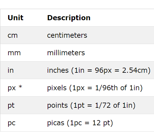
* Pixels (px) são relativos ao dispositivo de visualização. Para dispositivos de baixa resolução, 1 px é um pixel de dispositivo (ponto) da tela. Para impressoras e telas de alta resolução, 1px implica vários pixels do dispositivo.
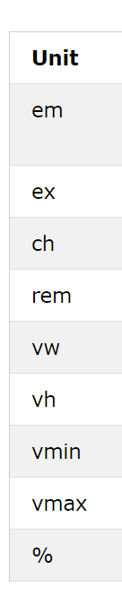
Comprimentos relativos
As unidades de comprimento relativo especificam um comprimento em relação a outra propriedade de comprimento. As unidades de comprimento relativo escalam melhor entre diferentes meios de renderização.
Veja alguns exemplos
Centímetros
<!DOCTYPE html>
<html>
<head>
<style>
h1 {font-size: 1.5cm;}
h2 {font-size: 1cm;}
p {
  font-size: 0.5cm;
  line-height: 1cm;
}
</style>
</head>
<body>

<h1>This is heading 1</h1>
<h2>This is heading 2</h2>
<p>This is a paragraph.</p>
<p>This is another paragraph.</p>

</body>
</html>
Milímetros
<!DOCTYPE html>
<html>
<head>
<style>
h1 {font-size: 15mm;}
h2 {font-size: 10mm;}
p {
  font-size: 5mm;
  line-height: 10mm;
}
</style>
</head>
<body>

<h1>This is heading 1</h1>
<h2>This is heading 2</h2>
<p>This is a paragraph.</p>
<p>This is another paragraph.</p>

</body>
</html>
In
<!DOCTYPE html>
<html>
<head>
<style>
h1 {font-size: 1in;}
h2 {font-size: 0.5in;}
p {
  font-size: 0.2in;
  line-height: 0.5in;
}
</style>
</head>
<body>

<h1>This is heading 1</h1>
<h2>This is heading 2</h2>
<p>This is a paragraph.</p>
<p>This is another paragraph.</p>

</body>
</html>
px
<!DOCTYPE html>
<html>
<head>
<style>
h1 {font-size: 50px;}
h2 {font-size: 30px;}
p {
  font-size: 15px;
  line-height: 20px;
}
</style>
</head>
<body>

<h1>This is heading 1</h1>
<h2>This is heading 2</h2>
<p>This is a paragraph.</p>
<p>This is another paragraph.</p>

</body>
</html>
pt
<!DOCTYPE html>
<html>
<head>
<style>
h1 {font-size: 50pt;}
h2 {font-size: 25pt;}
p {
  font-size: 15pt;
  line-height: 25pt;
}
</style>
</head>
<body>

<h1>This is heading 1</h1>
<h2>This is heading 2</h2>
<p>This is a paragraph.</p>
<p>This is another paragraph.</p>

</body>
</html>
pc
<!DOCTYPE html>
<html>
<head>
<style>
h1 {font-size: 4.5pc;}
h2 {font-size: 3pc;}
p {
  font-size: 1.5pc;
  line-height: 3pc;
}
</style>
</head>
<body>

<h1>This is heading 1</h1>
<h2>This is heading 2</h2>
<p>This is a paragraph.</p>
<p>This is another paragraph.</p>

</body>
</html>
em
<!DOCTYPE html>
<html>
<head>
<style>
p {
  font-size: 16px;
  line-height: 2em;
}

div {
  font-size: 30px;
  border: 1px solid black;
}

span {
  font-size: 0.5em;
}
</style>
</head>
<body>

<p>These paragraphs have a calculated line-height of: 2x16px = 32px.</p>
<p>These paragraphs have a calculated line-height of: 2x16px = 32px.</p>
<p>These paragraphs have a calculated line-height of: 2x16px = 32px.</p>
<div>The font-size of the div element is set to 30px. <span>The span element inside the div element has a font-size of 0.5em, which equals to 0.5x30 = 15px</span>.</div>

</body>
</html>
ex
<!DOCTYPE html>
<html>
<head>
<style>
div {
  font-size: 30px;
  border: 1px solid black;
}

span {
  font-size: 1ex;
}
</style>
</head>
<body>

<div>The font-size of the div element is set to 30px. <span>The span element inside the div element has a font-size of 1ex</span>.</div>

</body>
</html>
ch
<!DOCTYPE html>
<html>
<head>
<style>
body {
  font-size:16px;
}

div {
  font-size: 3ch;
  border: 1px solid black;
}
</style>
</head>
<body>

<p>The font-size of this document is 16px.</p>

<div>The font-size of this div element is 3ch.</div>

<p>The ch unit sets the font-size relative to the width of the character "0".</p>

</body>
</html>
rem
<!DOCTYPE html>
<html>
<head>
<style>
html {
  font-size:16px;
}

div {
  font-size: 3rem;
  border: 1px solid black;
}

#top-div {
  font-size: 2rem;
  border: 1px solid red;
}
</style>
</head>
<body>

<p>The font-size of this document is 16px.</p>

<div id="top-div">
The font-size of this div element is 2rem, which translates to 2 x the browser's font size.
<div>The font-size of this div element is 3rem. It also shows that it does not inherit from its parent element font size.</div>
</div>

<p>The rem unit sets the font-size relative to the browsers base font-size, and will not inherit from its parents.</p>

</body>
</html>
vw
<!DOCTYPE html>
<html>
<head>
<style>
h1 {
  font-size: 20vw;
}
</style>
</head>
<body>

<h1>Hello</h1>

<p>Resize the width of the browser window to see how the font-size of h1 changes.</p>
<p>1vw = 1% of viewport width.</p>
<p>The vw unit is not supported in IE8 and earlier.</p>

</body>
</html>
vh
<!DOCTYPE html>
<html>
<head>
<style>
h1 {
  font-size: 20vh;
}
</style>
</head>
<body>

<h1>Hello</h1>

<p>Resize the height of the browser window to see how the font-size of h1 changes.</p>
<p>1vh = 1% of viewport height.</p>
<p>The vh unit is not supported in IE8 and earlier.</p>

</body>
</html>
vmin
<!DOCTYPE html>
<html>
<head>
<style>
h1 {
  font-size: 15vmin;
}
</style>
</head>
<body>

<h1>Hello</h1>

<p>Resize the browser window (both width and height) to see how the font-size of h1 changes.</p>
<p>1vmin = 1vw or 1vh, whichever is smaller.</p>

</body>
</html>
vmax
<!DOCTYPE html>
<html>
<head>
<style>
h1 {
  font-size: 15vmax;
}
</style>
</head>
<body>

<h1>Hello</h1>

<p>Resize the browser window (both width and height) to see how the font-size of h1 changes.</p>
<p>1vmax = 1vw or 1vh, whichever is larger.</p>
<p>The vmax unit is not supported in Edge 15 and earlier, nor in Safari 6.1 and earlier.</p>

</body>
</html>
%
<!DOCTYPE html>
<html>
<head>
<style>
body {
 font-size:16px;
}

div {
  font-size: 150%;
  border: 1px solid black;
}

</style>
</head>
<body>

<p>The font-size of this document is 16px.</p>

<div>The font-size of this div element is 150%.</div>

<p>The % unit sets the font-size relative to the current font-size.</p>

</body>
</html>
<< Anterior Layout do site CSS


Deixe um comentário