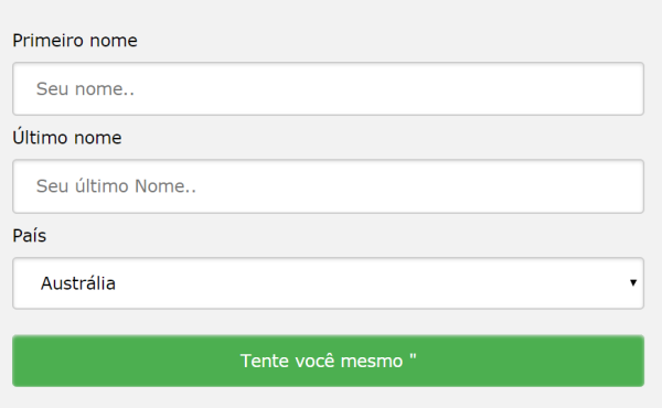
A aparência de um formulário HTML pode ser bastante aprimorada com CSS:
<!DOCTYPE html>
<html>
<style>
input[type=text], select {
  width: 100%;
  padding: 12px 20px;
  margin: 8px 0;
  display: inline-block;
  border: 1px solid #ccc;
  border-radius: 4px;
  box-sizing: border-box;
}

input[type=submit] {
  width: 100%;
  background-color: #4CAF50;
  color: white;
  padding: 14px 20px;
  margin: 8px 0;
  border: none;
  border-radius: 4px;
  cursor: pointer;
}

input[type=submit]:hover {
  background-color: #45a049;
}

div {
  border-radius: 5px;
  background-color: #f2f2f2;
  padding: 20px;
}
</style>
<body>

<h3>Using CSS to style an HTML Form</h3>

<div>
  <form action="/action_page.php">
    <label for="fname">First Name</label>
    <input type="text" id="fname" name="firstname" placeholder="Your name..">

    <label for="lname">Last Name</label>
    <input type="text" id="lname" name="lastname" placeholder="Your last name..">

    <label for="country">Country</label>
    <select id="country" name="country">
      <option value="australia">Australia</option>
      <option value="canada">Canada</option>
      <option value="usa">USA</option>
    </select>

    <input type="submit" value="Submit">
  </form>
</div>

</body>
</html>
Outro modelo
<!DOCTYPE html>
<html>
<head>
<style>
input {
  width: 100%;
}
</style>
</head>
<body>

<p>A full-width input field:</p>

<form>
  <label for="fname">First Name</label>
  <input type="text" id="fname" name="fname">
</form>

</body>
</html>
O exemplo acima se aplica a todos os elementos <input>. Se você quiser estilizar apenas um tipo de entrada específico, poderá usar seletores de atributos:
input[type=text] – selecionará apenas campos de texto
input[type=password] – selecionará apenas campos de senha
input[type=number] – selecionará apenas campos numéricos
etc ..
Entradas acolchoadas
Use a paddingpropriedade para adicionar espaço dentro do campo de texto.
Dica: Quando você tem muitas entradas uma após a outra, também pode querer adicionar algumas margin, para adicionar mais espaço fora delas:
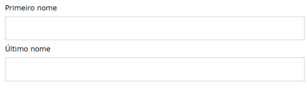
Entradas limitadas
Use a borderpropriedade para alterar o tamanho e a cor da borda e use a border-radiuspropriedade para adicionar cantos arredondados:
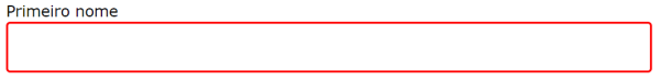
input[type=text] {

border: 2px solid red;

border-radius: 4px;

}
<!DOCTYPE html>
<html>
<head>
<style>
input[type=text] {
  width: 100%;
  padding: 12px 20px;
  margin: 8px 0;
  box-sizing: border-box;
  border: 2px solid red;
  border-radius: 4px;
}
</style>
</head>
<body>

<p>Text fields with borders:</p>

<form>
  <label for="fname">First Name</label>
  <input type="text" id="fname" name="fname">
  <label for="lname">Last Name</label>
  <input type="text" id="lname" name="lname">
</form>

</body>
</html>
Um modelo de uma linha só

<!DOCTYPE html>
<html>
<head>
<style>
input[type=text] {
  width: 100%;
  padding: 12px 20px;
  margin: 8px 0;
  box-sizing: border-box;
  border: none;
  border-bottom: 2px solid red;
}
</style>
</head>
<body>

<p>Text fields with only a bottom border:</p>

<form>
  <label for="fname">First Name</label>
  <input type="text" id="fname" name="fname">
  <label for="lname">Last Name</label>
  <input type="text" id="lname" name="lname">
</form>

</body>
</html>
Entradas coloridas
input[type=text] {

background-color: #3CBC8D;

color: white;

}
Use a background-colorpropriedade para adicionar uma cor de fundo à entrada e a color propriedade para alterar a cor do texto:
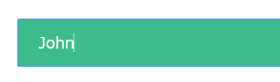
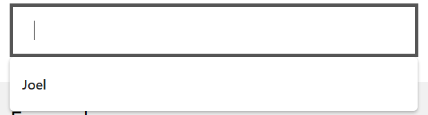
Entradas focadas
Por padrão, alguns navegadores adicionam um contorno azul ao redor da entrada quando ela é focada (clicada). Você pode remover esse comportamento adicionando outline: none;à entrada.
Use o :focusseletor para fazer algo com o campo de entrada quando ele receber o foco:
input[type=text]:focus {

background-color: lightblue;

}
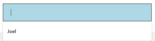
input[type=text]:focus {

border: 3px solid #555;

}
ou
<!DOCTYPE html>
<html>
<head>
<style>
input[type=text] {
  width: 100%;
  padding: 12px 20px;
  margin: 8px 0;
  box-sizing: border-box;
  border: 1px solid #555;
  outline: none;
}

input[type=text]:focus {
  background-color: lightblue;
}
</style>
</head>
<body>

<p>In this example, we use the :focus selector to add a background color to the text field when it gets focused (clicked on):</p>

<form>
  <label for="fname">First Name</label>
  <input type="text" id="fname" name="fname" value="John">
  <label for="lname">Last Name</label>
  <input type="text" id="lname" name="lname" value="Doe">
</form>

</body>
</html>
Entrada com ícone / imagem
Se você deseja um ícone dentro da entrada, use a background-imagepropriedade e posicione-a com a background-positionpropriedade Observe também que adicionamos um grande preenchimento esquerdo para reservar o espaço do ícone:
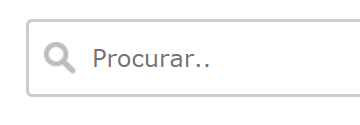
input[type=text] {

background-color: white;

background-image: url('searchicon.png');

background-position: 10px 10px;

background-repeat: no-repeat;

padding-left: 40px;

}
<!DOCTYPE html>
<html>
<head>
<style>
input[type=text] {
  width: 100%;
  box-sizing: border-box;
  border: 2px solid #ccc;
  border-radius: 4px;
  font-size: 16px;
  background-color: white;
  background-image: url('https://www.joemaster.com.br/tutoriais/wp-content/uploads/2020/06/favicon.jpg');
  background-position: 10px 10px;
  background-repeat: no-repeat;
  padding: 12px 20px 12px 40px;
}
</style>
</head>
<body>

<p>Input with icon:</p>

<form>
  <input type="text" name="search" placeholder="Search..">
</form>

</body>
</html>
Entrada de pesquisa animada
<!DOCTYPE html>
<html>
<head>
<style>
input[type=text] {
  width: 130px;
  box-sizing: border-box;
  border: 2px solid #ccc;
  border-radius: 4px;
  font-size: 16px;
  background-color: white;
  background-image: url('https://www.joemaster.com.br/tutoriais/wp-content/uploads/2020/06/favicon.jpg');
  background-position: 10px 10px;
  background-repeat: no-repeat;
  padding: 12px 20px 12px 40px;
  transition: width 0.4s ease-in-out;
}

input[type=text]:focus {
  width: 100%;
}
</style>
</head>
<body>

<p>Animated search input:</p>

<form>
  <input type="text" name="search" placeholder="Search..">
</form>

</body>
</html>
Menus de seleção de estilo
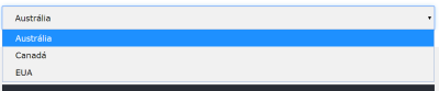
<!DOCTYPE html>
<html>
<head>
<style>
select {
  width: 100%;
  padding: 16px 20px;
  border: none;
  border-radius: 4px;
  background-color: #f1f1f1;
}
</style>
</head>
<body>

<p>A styled select menu.</p>

<form>
  <select id="country" name="country">
  <option value="au">Australia</option>
  <option value="ca">Canada</option>
  <option value="usa">USA</option>
  </select>
</form>

</body>
</html>
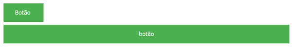
input[type=button], input[type=submit], input[type=reset] {
  background-color: #4CAF50;
  border: none;
  color: white;
  padding: 16px 32px;
  text-decoration: none;
  margin: 4px 2px;
  cursor: pointer;
}

/* Tip: use width: 100% for full-width buttons */
Teste agora
<!DOCTYPE html>
<html>
<head>
<style>
input[type=button], input[type=submit], input[type=reset] {
  background-color: #4CAF50;
  border: none;
  color: white;
  padding: 16px 32px;
  text-decoration: none;
  margin: 4px 2px;
  cursor: pointer;
}
</style>
</head>
<body>

<p>Styled input buttons.</p>

<input type="button" value="Button">
<input type="reset" value="Reset">
<input type="submit" value="Submit">

</body>
</html>
<< Anterior Sprites de imagem CSS


Deixe um comentário