Existem duas maneiras de criar uma barra de navegação horizontal. Usando itens de lista embutidos ou flutuantes .
Itens de lista embutidos
Uma maneira de criar uma barra de navegação horizontal é especificar os elementos <li> como embutidos, além do código “padrão” da página anterior:

Começando por um exemplo simples
<!DOCTYPE html>
<html>
<head>
<style>
ul {
  list-style-type: none;
  margin: 0;
  padding: 0;
}

li {
  display: inline;
}
</style>
</head>
<body>

<ul>
  <li><a href="#home">Home</a></li>
  <li><a href="#news">News</a></li>
  <li><a href="#contact">Contact</a></li>
  <li><a href="#about">About</a></li>
</ul>

</body>
</html>
Outro exemplo, já com conteúdo
<!DOCTYPE html>
<html>
<head>
<style>
ul {
  list-style-type: none;
  margin: 0;
  padding: 0;
  overflow: hidden;
}

li {
  float: left;
}

li a {
  display: block;
  padding: 8px;
  background-color: #dddddd;
}
</style>
</head>
<body>

<ul>
  <li><a href="#home">Home</a></li>
  <li><a href="#news">News</a></li>
  <li><a href="#contact">Contact</a></li>
  <li><a href="#about">About</a></li>
</ul>

<p><b>Note:</b> If a !DOCTYPE is not specified, floating items can produce unexpected results.</p>
<p>A background color is added to the links to show the link area. The whole link area is clickable, not just the text.</p>
<p><b>Note:</b> overflow:hidden is added to the ul element to prevent li elements from going outside of the list.</p>

</body>
</html>
Exemplo explicado:
float: left; – use float para fazer com que os elementos do bloco deslizem um ao lado do outro
display: block; – A exibição dos links como elementos de bloco faz com que toda a área do link seja clicável (não apenas o texto) e nos permite especificar preenchimento (e altura, largura, margens, etc., se desejar)
padding: 8px;– Como os elementos do bloco ocupam toda a largura disponível, eles não podem flutuar próximos um do outro. Portanto, especifique algum preenchimento para torná-los com boa aparência
background-color: #dddddd; – Adicione uma cor de fundo cinza a cada elemento
Dica: adicione a cor de fundo a <ul> em vez de cada elemento <a> se desejar uma cor de fundo com largura total:
Veja um código mais completo
<!DOCTYPE html>
<html>
<head>
<style>
ul {
  list-style-type: none;
  margin: 0;
  padding: 0;
  overflow: hidden;
  background-color: #333;
}

li {
  float: left;
}

li a {
  display: block;
  color: white;
  text-align: center;
  padding: 14px 16px;
  text-decoration: none;
}

li a:hover {
  background-color: #111;
}
</style>
</head>
<body>

<ul>
  <li><a class="active" href="#home">Home</a></li>
  <li><a href="#news">News</a></li>
  <li><a href="#contact">Contact</a></li>
  <li><a href="#about">About</a></li>
</ul>

</body>
</html>
Link de navegação ativo / atual
<!DOCTYPE html>
<html>
<head>
<style>
ul {
  list-style-type: none;
  margin: 0;
  padding: 0;
  overflow: hidden;
  background-color: #333;
}

li {
  float: left;
}

li a {
  display: block;
  color: white;
  text-align: center;
  padding: 14px 16px;
  text-decoration: none;
}

li a:hover:not(.active) {
  background-color: #111;
}

.active {
  background-color: #4CAF50;
}
</style>
</head>
<body>

<ul>
  <li><a class="active" href="#home">Home</a></li>
  <li><a href="#news">News</a></li>
  <li><a href="#contact">Contact</a></li>
  <li><a href="#about">About</a></li>
</ul>

</body>
</html>
Links de alinhamento à direita
<!DOCTYPE html>
<html>
<head>
<style>
ul {
  list-style-type: none;
  margin: 0;
  padding: 0;
  overflow: hidden;
  background-color: #333;
}

li {
  float: left;
}

li a {
  display: block;
  color: white;
  text-align: center;
  padding: 14px 16px;
  text-decoration: none;
}

li a:hover:not(.active) {
  background-color: #111;
}

.active {
  background-color: #4CAF50;
}
</style>
</head>
<body>

<ul>
  <li><a href="#home">Home</a></li>
  <li><a href="#news">News</a></li>
  <li><a href="#contact">Contact</a></li>
  <li style="float:right"><a class="active" href="#about">About</a></li>
</ul>

</body>
</html>
Com divisores
<!DOCTYPE html>
<html>
<head>
<style>
ul {
  list-style-type: none;
  margin: 0;
  padding: 0;
  overflow: hidden;
  background-color: #333;
}

li {
  float: left;
  border-right:1px solid #bbb;
}

li:last-child {
  border-right: none;
}

li a {
  display: block;
  color: white;
  text-align: center;
  padding: 14px 16px;
  text-decoration: none;
}

li a:hover:not(.active) {
  background-color: #111;
}

.active {
  background-color: #4CAF50;
}
</style>
</head>
<body>

<ul>
  <li><a class="active" href="#home">Home</a></li>
  <li><a href="#news">News</a></li>
  <li><a href="#contact">Contact</a></li>
  <li style="float:right"><a href="#about">About</a></li>
</ul>

</body>
</html>
Com topo fixo
<!DOCTYPE html>
<html>
<head>
<style>
body {margin:0;}

ul {
  list-style-type: none;
  margin: 0;
  padding: 0;
  overflow: hidden;
  background-color: #333;
  position: fixed;
  top: 0;
  width: 100%;
}

li {
  float: left;
}

li a {
  display: block;
  color: white;
  text-align: center;
  padding: 14px 16px;
  text-decoration: none;
}

li a:hover:not(.active) {
  background-color: #111;
}

.active {
  background-color: #4CAF50;
}
</style>
</head>
<body>

<ul>
  <li><a class="active" href="#home">Home</a></li>
  <li><a href="#news">News</a></li>
  <li><a href="#contact">Contact</a></li>
  <li><a href="#about">About</a></li>
</ul>

<div style="padding:20px;margin-top:30px;background-color:#1abc9c;height:1500px;">
  <h1>Fixed Top Navigation Bar</h1>
  <h2>Scroll this page to see the effect</h2>
  <h2>The navigation bar will stay at the top of the page while scrolling</h2>

  <p>Some text some text some text some text..</p>
  <p>Some text some text some text some text..</p>
  <p>Some text some text some text some text..</p>
  <p>Some text some text some text some text..</p>
  <p>Some text some text some text some text..</p>
  <p>Some text some text some text some text..</p>
  <p>Some text some text some text some text..</p>
  <p>Some text some text some text some text..</p>
  <p>Some text some text some text some text..</p>
  <p>Some text some text some text some text..</p>
  <p>Some text some text some text some text..</p>
  <p>Some text some text some text some text..</p>
  <p>Some text some text some text some text..</p>
  <p>Some text some text some text some text..</p>
  <p>Some text some text some text some text..</p>
  <p>Some text some text some text some text..</p>
  <p>Some text some text some text some text..</p>
  <p>Some text some text some text some text..</p>
  <p>Some text some text some text some text..</p>
  <p>Some text some text some text some text..</p>
</div>

</body>
</html>
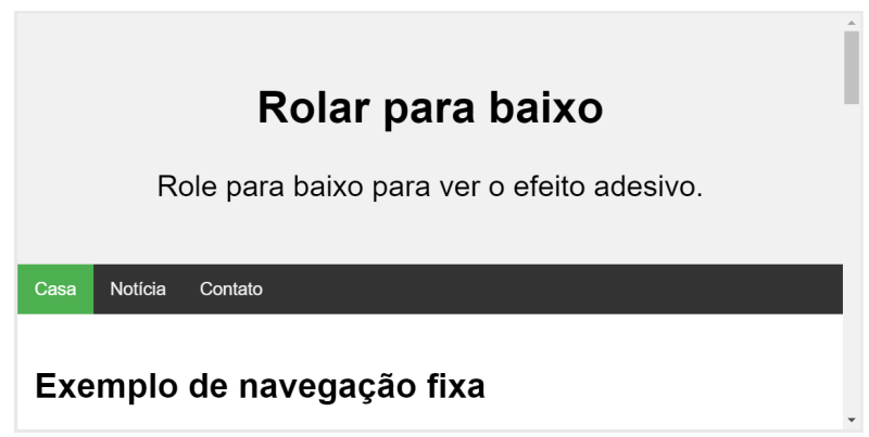
Adicione position: sticky;a <ul> para criar uma barra de navegação adesiva.
Um elemento adesivo alterna entre relativo e fixo, dependendo da posição de rolagem. É posicionado em relação até que uma determinada posição de deslocamento seja alcançada na janela de visualização – então “gruda” no lugar (como posição: fixa).
<!DOCTYPE html>
<html>
<head>
<style>
body {
  font-size: 28px;
}

ul {
  list-style-type: none;
  margin: 0;
  padding: 0;
  overflow: hidden;
  background-color: #333;
  position: -webkit-sticky; /* Safari */
  position: sticky;
  top: 0;
}

li {
  float: left;
}

li a {
  display: block;
  color: white;
  text-align: center;
  padding: 14px 16px;
  text-decoration: none;
}

li a:hover {
  background-color: #111;
}

.active {
  background-color: #4CAF50;
}
</style>
</head>
<body>

<div class="header">
  <h2>Scroll Down</h2>
  <p>Scroll down to see the sticky effect.</p>
</div>

<ul>
  <li><a class="active" href="#home">Home</a></li>
  <li><a href="#news">News</a></li>
  <li><a href="#contact">Contact</a></li>
</ul>

<h3>Sticky Navigation Bar Example</h3>
<p>The navbar will <strong>stick</strong> to the top when you reach its scroll position.</p>
<p><strong>Note:</strong> Internet Explorer, Edge 15 and earlier versions do not support sticky positioning. Safari requires a -webkit- prefix.</p>
<p>Some text to enable scrolling. Lorem ipsum dolor sit amet, illum definitiones no quo, maluisset concludaturque et eum, altera fabulas ut quo. Atqui causae gloriatur ius te, id agam omnis evertitur eum. Affert laboramus repudiandae nec et. Inciderint efficiantur his ad. Eum no molestiae voluptatibus.</p>
<p>Some text to enable scrolling. Lorem ipsum dolor sit amet, illum definitiones no quo, maluisset concludaturque et eum, altera fabulas ut quo. Atqui causae gloriatur ius te, id agam omnis evertitur eum. Affert laboramus repudiandae nec et. Inciderint efficiantur his ad. Eum no molestiae voluptatibus.</p>
<p>Some text to enable scrolling. Lorem ipsum dolor sit amet, illum definitiones no quo, maluisset concludaturque et eum, altera fabulas ut quo. Atqui causae gloriatur ius te, id agam omnis evertitur eum. Affert laboramus repudiandae nec et. Inciderint efficiantur his ad. Eum no molestiae voluptatibus.</p>
<p>Some text to enable scrolling. Lorem ipsum dolor sit amet, illum definitiones no quo, maluisset concludaturque et eum, altera fabulas ut quo. Atqui causae gloriatur ius te, id agam omnis evertitur eum. Affert laboramus repudiandae nec et. Inciderint efficiantur his ad. Eum no molestiae voluptatibus.</p>
<p>Some text to enable scrolling. Lorem ipsum dolor sit amet, illum definitiones no quo, maluisset concludaturque et eum, altera fabulas ut quo. Atqui causae gloriatur ius te, id agam omnis evertitur eum. Affert laboramus repudiandae nec et. Inciderint efficiantur his ad. Eum no molestiae voluptatibus.</p>
<p>Some text to enable scrolling. Lorem ipsum dolor sit amet, illum definitiones no quo, maluisset concludaturque et eum, altera fabulas ut quo. Atqui causae gloriatur ius te, id agam omnis evertitur eum. Affert laboramus repudiandae nec et. Inciderint efficiantur his ad. Eum no molestiae voluptatibus.</p>
<p>Some text to enable scrolling. Lorem ipsum dolor sit amet, illum definitiones no quo, maluisset concludaturque et eum, altera fabulas ut quo. Atqui causae gloriatur ius te, id agam omnis evertitur eum. Affert laboramus repudiandae nec et. Inciderint efficiantur his ad. Eum no molestiae voluptatibus.</p>

</body>
</html>
E por último um layout responsivo
<!DOCTYPE html>
<html>
<head>
<meta name="viewport" content="width=device-width, initial-scale=1.0">
<style>
body {margin: 0;}

ul.sidenav {
  list-style-type: none;
  margin: 0;
  padding: 0;
  width: 25%;
  background-color: #f1f1f1;
  position: fixed;
  height: 100%;
  overflow: auto;
}

ul.sidenav li a {
  display: block;
  color: #000;
  padding: 8px 16px;
  text-decoration: none;
}

ul.sidenav li a.active {
  background-color: #4CAF50;
  color: white;
}

ul.sidenav li a:hover:not(.active) {
  background-color: #555;
  color: white;
}

div.content {
  margin-left: 25%;
  padding: 1px 16px;
  height: 1000px;
}

@media screen and (max-width: 900px) {
  ul.sidenav {
    width: 100%;
    height: auto;
    position: relative;
  }

  ul.sidenav li a {
    float: left;
    padding: 15px;
  }

  div.content {margin-left: 0;}
}

@media screen and (max-width: 400px) {
  ul.sidenav li a {
    text-align: center;
    float: none;
  }
}
</style>
</head>
<body>

<ul class="sidenav">
  <li><a class="active" href="#home">Home</a></li>
  <li><a href="#news">News</a></li>
  <li><a href="#contact">Contact</a></li>
  <li><a href="#about">About</a></li>
</ul>

<div class="content">
  <h2>Responsive Sidenav Example</h2>
  <p>This example use media queries to transform the sidenav to a top navigation bar when the screen size is 900px or less.</p>
  <p>We have also added a media query for screens that are 400px or less, which will vertically stack and center the navigation links.</p>
  <p>You will learn more about media queries and responsive web design later in our CSS Tutorial.</p>
  <h3>Resize the browser window to see the effect.</h3>
</div>

</body>
</html>
<< Anterior Barra de navegação vertical CSS

Deixe um comentário