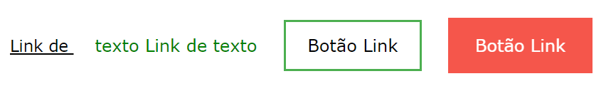
Com CSS, os links podem ser estilizados de maneiras diferentes.
Ligações de estilo
Os links podem ser decorados com qualquer propriedade CSS (por exemplo color, font-family, background, etc.).
Exemplo
a {
color: hotpink;
}
<!DOCTYPE html>
<html>
<head>
<style>
a {
  color: hotpink;
}
</style>
</head>
<body>

<p><b><a href="default.asp" target="_blank">This is a link</a></b></p>

</body>
</html>
Além disso, os links podem ter estilos diferentes, dependendo do estado em que estão.
Os quatro estados dos links são:
a:link – um link normal e não visitado
a:visited – um link que o usuário visitou
a:hover – um link quando o usuário passa o mouse sobre ele
a:active - um link no momento em que é clicado
Exemplo
/* unvisited link */
a:link {
color: red;
}
/* visited link */
a:visited {
color: green;
}
/* mouse over link */
a:hover {
color: hotpink;
}
/* selected link */
a:active {
color: blue;
}
<!DOCTYPE html>
<html>
<head>
<style>
/* unvisited link */
a:link {
  color: red;
}

/* visited link */
a:visited {
  color: green;
}

/* mouse over link */
a:hover {
  color: hotpink;
}

/* selected link */
a:active {
  color: blue;
}
</style>
</head>
<body>

<p><b><a href="default.asp" target="_blank">This is a link</a></b></p>
<p><b>Note:</b> a:hover MUST come after a:link and a:visited in the CSS definition in order to be effective.</p>
<p><b>Note:</b> a:active MUST come after a:hover in the CSS definition in order to be effective.</p>

</body>
</html>
Background Color
The background-color property can be used to specify a background color for links:
Example
a:link {
background-color: yellow;
}
a:visited {
background-color: cyan;
}
a:hover {
background-color: lightgreen;
}
a:active {
background-color: hotpink;
}
<!DOCTYPE html>
<html>
<head>
<style>
a:link {
  background-color: yellow;
}

a:visited {
  background-color: cyan;
}

a:hover {
  background-color: lightgreen;
}

a:active {
  background-color: hotpink;
}
</style>
</head>
<body>

<p><b><a href="default.asp" target="_blank">This is a link</a></b></p>
<p><b>Note:</b> a:hover MUST come after a:link and a:visited in the CSS definition in order to be effective.</p>
<p><b>Note:</b> a:active MUST come after a:hover in the CSS definition in order to be effective.</p>

</body>
</html>
Link Buttons
This example demonstrates a more advanced example where we combine several CSS properties to display links as boxes/buttons:
Example
a:link, a:visited {
background-color: #f44336;
color: white;
padding: 14px 25px;
text-align: center;
text-decoration: none;
display: inline-block;
}
a:hover, a:active {
background-color: red;
}
<!DOCTYPE html>
<html>
<head>
<style>
a:link, a:visited {
  background-color: #f44336;
  color: white;
  padding: 14px 25px;
  text-align: center;
  text-decoration: none;
  display: inline-block;
}

a:hover, a:active {
  background-color: red;
}
</style>
</head>
<body>

<h2>Link Button</h2>
<p>A link styled as a button:</p>
<a href="default.asp" target="_blank">This is a link</a>

</body>
</html>
Veja esse script com diferentes efeito no cursor
<!DOCTYPE html>
<html>
<body>

<p>Mouse over the words to change the cursor.</p>
<span style="cursor:auto">auto</span><br>
<span style="cursor:crosshair">crosshair</span><br>
<span style="cursor:default">default</span><br>
<span style="cursor:e-resize">e-resize</span><br>
<span style="cursor:help">help</span><br>
<span style="cursor:move">move</span><br>
<span style="cursor:n-resize">n-resize</span><br>
<span style="cursor:ne-resize">ne-resize</span><br>
<span style="cursor:nw-resize">nw-resize</span><br>
<span style="cursor:pointer">pointer</span><br>
<span style="cursor:progress">progress</span><br>
<span style="cursor:s-resize">s-resize</span><br>
<span style="cursor:se-resize">se-resize</span><br>
<span style="cursor:sw-resize">sw-resize</span><br>
<span style="cursor:text">text</span><br>
<span style="cursor:w-resize">w-resize</span><br>
<span style="cursor:wait">wait</span><br>

</body>
</html>
<< Anterior Ícones CSS

Deixe um comentário