Um site geralmente é dividido em cabeçalhos, menus, conteúdo e rodapé:
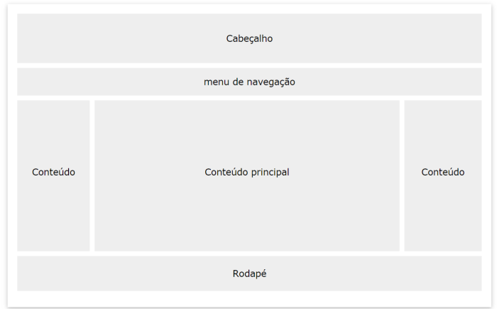
Existem vários designs de layout diferentes para você escolher. No entanto, a estrutura acima é uma das mais comuns e analisaremos mais de perto neste tutorial.
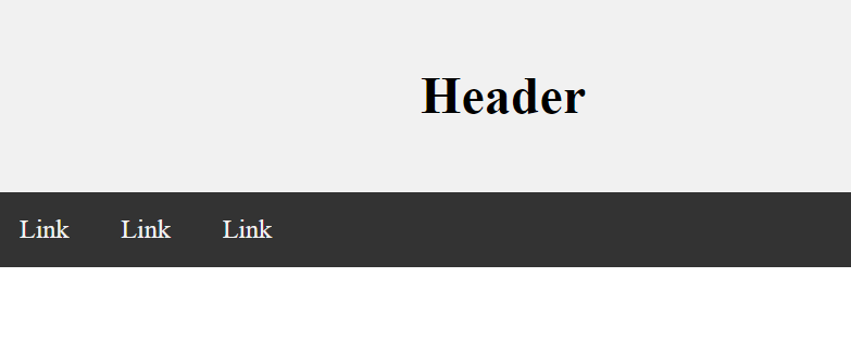
Cabeçalho
Um cabeçalho geralmente está localizado na parte superior do site (ou logo abaixo de um menu de navegação superior). Muitas vezes, contém um logotipo ou o nome do site:
.header {

background-color: #F1F1F1;

text-align: center;

padding: 20px;

}
<!DOCTYPE html>
<html lang="en">
<head>
<title>CSS Website Layout</title>
<meta charset="utf-8">
<meta name="viewport" content="width=device-width, initial-scale=1">
<style>
body {
  margin: 0;
}

/* Style the header */
.header {
  background-color: #f1f1f1;
  padding: 20px;
  text-align: center;
}
</style>
</head>
<body>

<div class="header">
  <h1>Header</h1>
</div>

</body>
</html>
Barra de navegação
Uma barra de navegação contém uma lista de links para ajudar os visitantes a navegar pelo seu site:
<!DOCTYPE html>
<html lang="en">
<head>
<title>CSS Website Layout</title>
<meta charset="utf-8">
<meta name="viewport" content="width=device-width, initial-scale=1">
<style>
* {
  box-sizing: border-box;
}

body {
  margin: 0;
}

/* Style the header */
.header {
  background-color: #f1f1f1;
  padding: 20px;
  text-align: center;
}

/* Style the top navigation bar */
.topnav {
  overflow: hidden;
  background-color: #333;
}

/* Style the topnav links */
.topnav a {
  float: left;
  display: block;
  color: #f2f2f2;
  text-align: center;
  padding: 14px 16px;
  text-decoration: none;
}

/* Change color on hover */
.topnav a:hover {
  background-color: #ddd;
  color: black;
}
</style>
</head>
<body>

<div class="header">
  <h1>Header</h1>
</div>

<div class="topnav">
  <a href="#">Link</a>
  <a href="#">Link</a>
  <a href="#">Link</a>
</div>

</body>
</html>
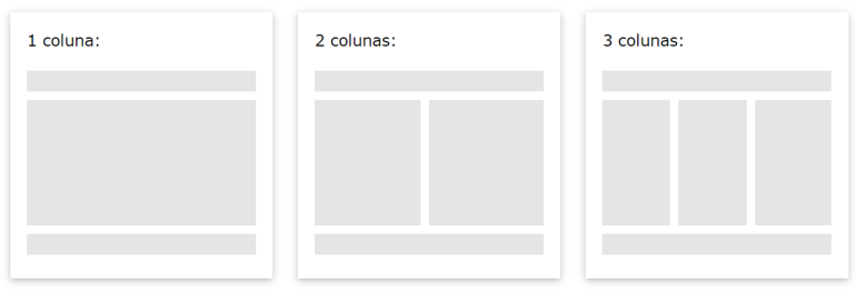
Conteúdo
O layout desta seção geralmente depende dos usuários de destino. O layout mais comum é um (ou combiná-los) dos seguintes:
1 coluna (geralmente usada para navegadores de celular)
2 colunas (geralmente usado para tablets e laptops)
Layout de 3 colunas (usado apenas para desktops)
<!DOCTYPE html>
<html lang="en">
<head>
<title>CSS Website Layout</title>
<meta charset="utf-8">
<meta name="viewport" content="width=device-width, initial-scale=1">
<style>
* {
  box-sizing: border-box;
}

body {
  margin: 0;
}

/* Style the header */
.header {
  background-color: #f1f1f1;
  padding: 20px;
  text-align: center;
}

/* Style the top navigation bar */
.topnav {
  overflow: hidden;
  background-color: #333;
}

/* Style the topnav links */
.topnav a {
  float: left;
  display: block;
  color: #f2f2f2;
  text-align: center;
  padding: 14px 16px;
  text-decoration: none;
}

/* Change color on hover */
.topnav a:hover {
  background-color: #ddd;
  color: black;
}

/* Create three equal columns that floats next to each other */
.column {
  float: left;
  width: 33.33%;
  padding: 15px;
}

/* Clear floats after the columns */
.row:after {
  content: "";
  display: table;
  clear: both;
}

/* Responsive layout - makes the three columns stack on top of each other instead of next to each other */
@media screen and (max-width:600px) {
  .column {
    width: 100%;
  }
}
</style>
</head>
<body>

<div class="header">
  <h1>Header</h1>
  <p>Resize the browser window to see the responsive effect.</p>
</div>

<div class="topnav">
  <a href="#">Link</a>
  <a href="#">Link</a>
  <a href="#">Link</a>
</div>

<div class="row">
  <div class="column">
    <h2>Column</h2>
    <p>Lorem ipsum dolor sit amet, consectetur adipiscing elit. Maecenas sit amet pretium urna. Vivamus venenatis velit nec neque ultricies, eget elementum magna tristique. Quisque vehicula, risus eget aliquam placerat, purus leo tincidunt eros, eget luctus quam orci in velit. Praesent scelerisque tortor sed accumsan convallis.</p>
  </div>
</div>

</body>
</html>
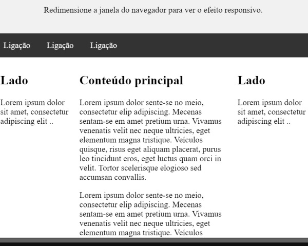
Colunas desiguais
O conteúdo principal é a parte maior e mais importante do seu site.
É comum com larguras desiguais de colunas, para que a maior parte do espaço seja reservada para o conteúdo principal. O conteúdo lateral (se houver) é frequentemente usado como uma navegação alternativa ou para especificar informações relevantes para o conteúdo principal. Altere as larguras como desejar, mas lembre-se de que deve somar 100% no total:
<!DOCTYPE html>
<html lang="en">
<head>
<title>CSS Website Layout</title>
<meta charset="utf-8">
<meta name="viewport" content="width=device-width, initial-scale=1">
<style>
* {
  box-sizing: border-box;
}

body {
  margin: 0;
}

/* Style the header */
.header {
  background-color: #f1f1f1;
  padding: 20px;
  text-align: center;
}

/* Style the top navigation bar */
.topnav {
  overflow: hidden;
  background-color: #333;
}

/* Style the topnav links */
.topnav a {
  float: left;
  display: block;
  color: #f2f2f2;
  text-align: center;
  padding: 14px 16px;
  text-decoration: none;
}

/* Change color on hover */
.topnav a:hover {
  background-color: #ddd;
  color: black;
}

/* Create three unequal columns that floats next to each other */
.column {
  float: left;
  padding: 10px;
}

/* Left and right column */
.column.side {
  width: 25%;
}

/* Middle column */
.column.middle {
  width: 50%;
}

/* Clear floats after the columns */
.row:after {
  content: "";
  display: table;
  clear: both;
}

/* Responsive layout - makes the three columns stack on top of each other instead of next to each other */
@media screen and (max-width: 600px) {
  .column.side, .column.middle {
    width: 100%;
  }
}
</style>
</head>
<body>

<div class="header">
  <h1>Header</h1>
  <p>Resize the browser window to see the responsive effect.</p>
</div>

<div class="topnav">
  <a href="#">Link</a>
  <a href="#">Link</a>
  <a href="#">Link</a>
</div>

<div class="row">
  <div class="column side">
    <h2>Side</h2>
    <p>Lorem ipsum dolor sit amet, consectetur adipiscing elit..</p>
  </div>

  <div class="column middle">
    <h2>Main Content</h2>
    <p>Lorem ipsum dolor sit amet, consectetur adipiscing elit. Maecenas sit amet pretium urna. Vivamus venenatis velit nec neque ultricies, eget elementum magna tristique. Quisque vehicula, risus eget aliquam placerat, purus leo tincidunt eros, eget luctus quam orci in velit. Praesent scelerisque tortor sed accumsan convallis.</p>
    <p>Lorem ipsum dolor sit amet, consectetur adipiscing elit. Maecenas sit amet pretium urna. Vivamus venenatis velit nec neque ultricies, eget elementum magna tristique. Quisque vehicula, risus eget aliquam placerat, purus leo tincidunt eros, eget luctus quam orci in velit. Praesent scelerisque tortor sed accumsan convallis.</p>
  </div>

  <div class="column side">
    <h2>Side</h2>
    <p>Lorem ipsum dolor sit amet, consectetur adipiscing elit..</p>
  </div>
</div>

</body>
</html>
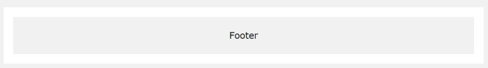
Rodapé
.footer {

background-color: #F1F1F1;

text-align: center;

padding: 10px;

}
O rodapé é colocado na parte inferior da sua página. Muitas vezes, contém informações como direitos autorais e informações de contato:
<!DOCTYPE html>
<html lang="en">
<head>
<title>CSS Website Layout</title>
<meta charset="utf-8">
<meta name="viewport" content="width=device-width, initial-scale=1">
<style>
* {
  box-sizing: border-box;
}

body {
  margin: 0;
}

/* Style the header */
.header {
  background-color: #f1f1f1;
  padding: 20px;
  text-align: center;
}

/* Style the top navigation bar */
.topnav {
  overflow: hidden;
  background-color: #333;
}

/* Style the topnav links */
.topnav a {
  float: left;
  display: block;
  color: #f2f2f2;
  text-align: center;
  padding: 14px 16px;
  text-decoration: none;
}

/* Change color on hover */
.topnav a:hover {
  background-color: #ddd;
  color: black;
}

/* Create three unequal columns that floats next to each other */
.column {
  float: left;
  padding: 10px;
}

/* Left and right column */
.column.side {
  width: 25%;
}

/* Middle column */
.column.middle {
  width: 50%;
}

/* Clear floats after the columns */
.row:after {
  content: "";
  display: table;
  clear: both;
}

/* Responsive layout - makes the three columns stack on top of each other instead of next to each other */
@media screen and (max-width: 600px) {
  .column.side, .column.middle {
    width: 100%;
  }
}

/* Style the footer */
.footer {
  background-color: #f1f1f1;
  padding: 10px;
  text-align: center;
}
</style>
</head>
<body>

<div class="header">
  <h1>Header</h1>
  <p>Resize the browser window to see the responsive effect.</p>
</div>

<div class="topnav">
  <a href="#">Link</a>
  <a href="#">Link</a>
  <a href="#">Link</a>
</div>

<div class="row">
  <div class="column side">
    <h2>Side</h2>
    <p>Lorem ipsum dolor sit amet, consectetur adipiscing elit..</p>
  </div>

  <div class="column middle">
    <h2>Main Content</h2>
    <p>Lorem ipsum dolor sit amet, consectetur adipiscing elit. Maecenas sit amet pretium urna. Vivamus venenatis velit nec neque ultricies, eget elementum magna tristique. Quisque vehicula, risus eget aliquam placerat, purus leo tincidunt eros, eget luctus quam orci in velit. Praesent scelerisque tortor sed accumsan convallis.</p>
    <p>Lorem ipsum dolor sit amet, consectetur adipiscing elit. Maecenas sit amet pretium urna. Vivamus venenatis velit nec neque ultricies, eget elementum magna tristique. Quisque vehicula, risus eget aliquam placerat, purus leo tincidunt eros, eget luctus quam orci in velit. Praesent scelerisque tortor sed accumsan convallis.</p>
  </div>

  <div class="column side">
    <h2>Side</h2>
    <p>Lorem ipsum dolor sit amet, consectetur adipiscing elit..</p>
  </div>
</div>

<div class="footer">
  <p>Footer</p>
</div>

</body>
</html>
Agora teste um layout completo
<!DOCTYPE html>
<html>
<head>
<style>
* {
  box-sizing: border-box;
}

body {
  font-family: Arial;
  padding: 10px;
  background: #f1f1f1;
}

/* Header/Blog Title */
.header {
  padding: 30px;
  text-align: center;
  background: white;
}

.header h1 {
  font-size: 50px;
}

/* Style the top navigation bar */
.topnav {
  overflow: hidden;
  background-color: #333;
}

/* Style the topnav links */
.topnav a {
  float: left;
  display: block;
  color: #f2f2f2;
  text-align: center;
  padding: 14px 16px;
  text-decoration: none;
}

/* Change color on hover */
.topnav a:hover {
  background-color: #ddd;
  color: black;
}

/* Create two unequal columns that floats next to each other */
/* Left column */
.leftcolumn {
  float: left;
  width: 75%;
}

/* Right column */
.rightcolumn {
  float: left;
  width: 25%;
  background-color: #f1f1f1;
  padding-left: 20px;
}

/* Fake image */
.fakeimg {
  background-color: #aaa;
  width: 100%;
  padding: 20px;
}

/* Add a card effect for articles */
.card {
  background-color: white;
  padding: 20px;
  margin-top: 20px;
}

/* Clear floats after the columns */
.row:after {
  content: "";
  display: table;
  clear: both;
}

/* Footer */
.footer {
  padding: 20px;
  text-align: center;
  background: #ddd;
  margin-top: 20px;
}

/* Responsive layout - when the screen is less than 800px wide, make the two columns stack on top of each other instead of next to each other */
@media screen and (max-width: 800px) {
  .leftcolumn, .rightcolumn {
    width: 100%;
    padding: 0;
  }
}

/* Responsive layout - when the screen is less than 400px wide, make the navigation links stack on top of each other instead of next to each other */
@media screen and (max-width: 400px) {
  .topnav a {
    float: none;
    width: 100%;
  }
}
</style>
</head>
<body>

<div class="header">
  <h1>My Website</h1>
  <p>Resize the browser window to see the effect.</p>
</div>

<div class="topnav">
  <a href="#">Link</a>
  <a href="#">Link</a>
  <a href="#">Link</a>
  <a href="#" style="float:right">Link</a>
</div>

<div class="row">
  <div class="leftcolumn">
    <div class="card">
      <h2>TITLE HEADING</h2>
      <h5>Title description, Dec 7, 2017</h5>
      <div class="fakeimg" style="height:200px;">Image</div>
      <p>Some text..</p>
      <p>Sunt in culpa qui officia deserunt mollit anim id est laborum consectetur adipiscing elit, sed do eiusmod tempor incididunt ut labore et dolore magna aliqua. Ut enim ad minim veniam, quis nostrud exercitation ullamco.</p>
    </div>
    <div class="card">
      <h2>TITLE HEADING</h2>
      <h5>Title description, Sep 2, 2017</h5>
      <div class="fakeimg" style="height:200px;">Image</div>
      <p>Some text..</p>
      <p>Sunt in culpa qui officia deserunt mollit anim id est laborum consectetur adipiscing elit, sed do eiusmod tempor incididunt ut labore et dolore magna aliqua. Ut enim ad minim veniam, quis nostrud exercitation ullamco.</p>
    </div>
  </div>
  <div class="rightcolumn">
    <div class="card">
      <h2>About Me</h2>
      <div class="fakeimg" style="height:100px;">Image</div>
      <p>Some text about me in culpa qui officia deserunt mollit anim..</p>
    </div>
    <div class="card">
      <h3>Popular Post</h3>
      <div class="fakeimg"><p>Image</p></div>
      <div class="fakeimg"><p>Image</p></div>
      <div class="fakeimg"><p>Image</p></div>
    </div>
    <div class="card">
      <h3>Follow Me</h3>
      <p>Some text..</p>
    </div>
  </div>
</div>

<div class="footer">
  <h2>Footer</h2>
</div>

</body>
</html>
<< Anterior Contadores CSS

Deixe um comentário