Esta página contém exemplos comuns de flutuação.
<!DOCTYPE html>
<html>
<head>
<style>
* {
box-sizing: border-box;
}
.box {
float: left;
width: 33.33%;
padding: 50px;
}
.clearfix::after {
content: "";
clear: both;
display: table;
}
</style>
</head>
<body>
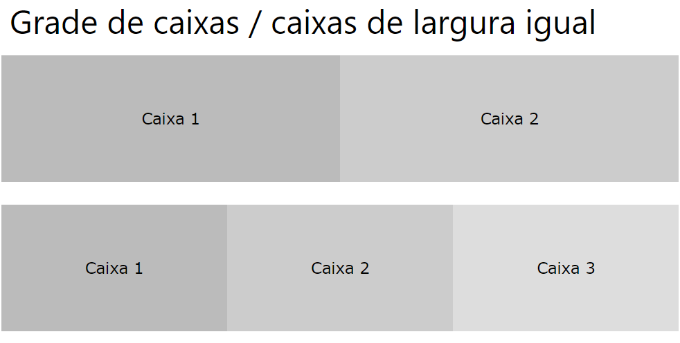
<h2>Grid of Boxes</h2>
<p>Float boxes side by side:</p>
<div class="clearfix">
<div class="box" style="background-color:#bbb">
<p>Some text inside the box.</p>
</div>
<div class="box" style="background-color:#ccc">
<p>Some text inside the box.</p>
</div>
<div class="box" style="background-color:#ddd">
<p>Some text inside the box.</p>
</div>
</div>
<p>Note that we also use the clearfix hack to take care of the layout flow, and that add the box-sizing property to make sure that the box doesn't break due to extra padding. Try to remove this code to see the effect.</p>
</body>
</html>
<!DOCTYPE html>
<html>
<head>
<style>
* {
box-sizing: border-box;
}
.img-container {
float: left;
width: 33.33%;
padding: 5px;
}
.clearfix::after {
content: "";
clear: both;
display: table;
}
</style>
</head>
<body>
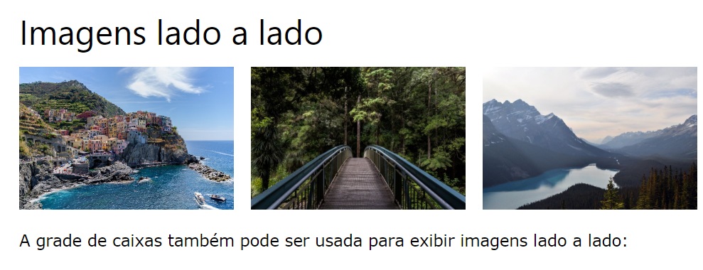
<h2>Images Side by Side</h2>
<p>Float images side by side:</p>
<div class="clearfix">
<div class="img-container">
<img src="https://www.joemaster.com.br/tutoriais/wp-content/uploads/2020/06/estrutura-basica-de-um-documento-css-1-300x169.jpg" alt="Italy" style="width:100%">
</div>
<div class="img-container">
<img src="https://www.joemaster.com.br/tutoriais/wp-content/uploads/2020/06/estrutura-basica-de-um-documento-css-1-300x169.jpg" alt="Forest" style="width:100%">
</div>
<div class="img-container">
<img src="https://www.joemaster.com.br/tutoriais/wp-content/uploads/2020/06/estrutura-basica-de-um-documento-css-1-300x169.jpg" alt="Mountains" style="width:100%">
</div>
</div>
<p>Note that we also use the clearfix hack to take care of the layout flow, and that we add the box-sizing property to make sure that the image container doesn't break due to extra padding. Try to remove this code to see the effect.</p>
</body>
</html>
Caixas de altura igual
<!DOCTYPE html>
<html>
<head>
<style>
* {
box-sizing: border-box;
}
.box {
float: left;
width: 50%;
padding: 50px;
height: 300px;
}
.clearfix::after {
content: "";
clear: both;
display: table;
}
</style>
</head>
<body>
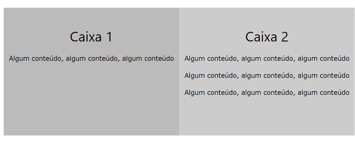
<h2>Equal Height Boxes</h2>
<p>Floating boxes with equal heights:</p>
<div class="clearfix">
<div class="box" style="background-color:#bbb">
<h2>Box 1</h2>
<p>Some content, some content, some content</p>
</div>
<div class="box" style="background-color:#ccc">
<h2>Box 2</h2>
<p>Some content, some content, some content</p>
<p>Some content, some content, some content</p>
<p>Some content, some content, some content</p>
</div>
</div>
<p>This example not very flexible. It is ok to use CSS height if you can guarantee that the boxes will always have the same amount of content in them, but that's not always the case. If you try the example above on a mobile phone (or resize the browser window), you will see that the second box's content will be displayed outside of the box.</p>
<p>Go back to the tutorial and find another solution, if this is not what you want.</p>
</body>
</html>
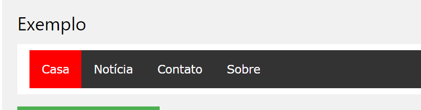
Menus de navegação
<!DOCTYPE html>
<html>
<head>
<style>
ul {
  list-style-type: none;
  margin: 0;
  padding: 0;
  overflow: hidden;
  background-color: #333;
}

li {
  float: left;
}

li a {
  display: inline-block;
  color: white;
  text-align: center;
  padding: 14px 16px;
  text-decoration: none;
}

li a:hover {
  background-color: #111;
}

.active {
  background-color: red;
}
</style>
</head>
<body>

<ul>
  <li><a href="#home" class="active">Home</a></li>
  <li><a href="#news">News</a></li>
  <li><a href="#contact">Contact</a></li>
  <li><a href="#about">About</a></li>
</ul>

</body>
</html>
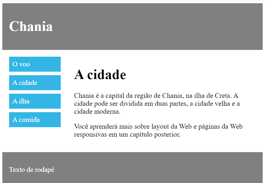
Também é comum fazer layouts da Web inteiros usando a floatpropriedade:
<!DOCTYPE html>
<html>
<head>
<style>
* {
  box-sizing: border-box;
}

.header, .footer {
  background-color: grey;
  color: white;
  padding: 15px;
}

.column {
  float: left;
  padding: 15px;
}

.clearfix::after {
  content: "";
  clear: both;
  display: table;
}

.menu {
  width: 25%;
}

.content {
  width: 75%;
}

.menu ul {
  list-style-type: none;
  margin: 0;
  padding: 0;
}

.menu li {
  padding: 8px;
  margin-bottom: 8px;
  background-color: #33b5e5;
  color: #ffffff;
}

.menu li:hover {
  background-color: #0099cc;
}
</style>
</head>
<body>

<div class="header">
  <h1>Chania</h1>
</div>

<div class="clearfix">
  <div class="column menu">
    <ul>
      <li>The Flight</li>
      <li>The City</li>
      <li>The Island</li>
      <li>The Food</li>
    </ul>
  </div>

  <div class="column content">
    <h1>The City</h1>
    <p>Chania is the capital of the Chania region on the island of Crete. The city can be divided in two parts, the old town and the modern city.</p>
    <p>You will learn more about web layout and responsive web pages in a later chapter.</p>
  </div>
</div>

<div class="footer">
  <p>Footer Text</p>
</div>

</body>
</html>
<< Anterior Layout CSS – float e clear

Deixe um comentário