Os sites geralmente exibem conteúdo em várias colunas (como uma revista ou um jornal).
<!DOCTYPE html>
<html lang="en">
<head>
<title>CSS Template</title>
<meta charset="utf-8">
<meta name="viewport" content="width=device-width, initial-scale=1">
<style>
* {
  box-sizing: border-box;
}

body {
  font-family: Arial, Helvetica, sans-serif;
}

/* Style the header */
header {
  background-color: #666;
  padding: 30px;
  text-align: center;
  font-size: 35px;
  color: white;
}

/* Create two columns/boxes that floats next to each other */
nav {
  float: left;
  width: 30%;
  height: 300px; /* only for demonstration, should be removed */
  background: #ccc;
  padding: 20px;
}

/* Style the list inside the menu */
nav ul {
  list-style-type: none;
  padding: 0;
}

article {
  float: left;
  padding: 20px;
  width: 70%;
  background-color: #f1f1f1;
  height: 300px; /* only for demonstration, should be removed */
}

/* Clear floats after the columns */
section:after {
  content: "";
  display: table;
  clear: both;
}

/* Style the footer */
footer {
  background-color: #777;
  padding: 10px;
  text-align: center;
  color: white;
}

/* Responsive layout - makes the two columns/boxes stack on top of each other instead of next to each other, on small screens */
@media (max-width: 600px) {
  nav, article {
    width: 100%;
    height: auto;
  }
}
</style>
</head>
<body>

<h2>CSS Layout Float</h2>
<p>In this example, we have created a header, two columns/boxes and a footer. On smaller screens, the columns will stack on top of each other.</p>
<p>Resize the browser window to see the responsive effect (you will learn more about this in our next chapter - HTML Responsive.)</p>

<header>
  <h2>Cities</h2>
</header>

<section>
  <nav>
    <ul>
      <li><a href="#">London</a></li>
      <li><a href="#">Paris</a></li>
      <li><a href="#">Tokyo</a></li>
    </ul>
  </nav>

  <article>
    <h1>London</h1>
    <p>London is the capital city of England. It is the most populous city in the  United Kingdom, with a metropolitan area of over 13 million inhabitants.</p>
    <p>Standing on the River Thames, London has been a major settlement for two millennia, its history going back to its founding by the Romans, who named it Londinium.</p>
  </article>
</section>

<footer>
  <p>Footer</p>
</footer>

</body>
</html>
Confira um layout padrão
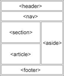
<header> – Define um cabeçalho para um documento ou uma seção
<nav> – Define um conjunto de links de navegação
<section> – Define uma seção em um documento
<article> – Define um conteúdo independente e independente
<aside> – Define o conteúdo além do conteúdo (como uma barra lateral)
<footer> – Define um rodapé para um documento ou uma seção
<details> – Define detalhes adicionais que o usuário pode abrir e fechar sob demanda
<summary>– Define um cabeçalho para o <details>elemento
Layout de flutuador CSS
É comum fazer layouts da Web inteiros usando a float propriedade CSS . O float é fácil de aprender – você só precisa se lembrar de como as propriedades floate clear funcionam.
Desvantagens: Os elementos flutuantes estão vinculados ao fluxo do documento, o que pode prejudicar a flexibilidade.
Result Size: 625 x 470
<!DOCTYPE html>
<html lang="en">
<head>
<title>CSS Template</title>
<meta charset="utf-8">
<meta name="viewport" content="width=device-width, initial-scale=1">
<style>
* {
box-sizing: border-box;
}
body {
font-family: Arial, Helvetica, sans-serif;
}
/* Style the header */
header {
background-color: #666;
padding: 30px;
text-align: center;
font-size: 35px;
color: white;
}
/* Create two columns/boxes that floats next to each other */
nav {
float: left;
width: 30%;
height: 300px; /* only for demonstration, should be removed */
background: #ccc;
padding: 20px;
}
/* Style the list inside the menu */
nav ul {
Layout do CSS Flexbox
Flexbox é um novo modo de layout no CSS3.
O uso do flexbox garante que os elementos se comportem de maneira previsível quando o layout da página deve acomodar diferentes tamanhos de tela e diferentes dispositivos de exibição.
<!DOCTYPE html>
<html lang="en">
<head>
<title>CSS Template</title>
<meta charset="utf-8">
<meta name="viewport" content="width=device-width, initial-scale=1">
<style>
* {
  box-sizing: border-box;
}

body {
  font-family: Arial, Helvetica, sans-serif;
}

/* Style the header */
header {
  background-color: #666;
  padding: 30px;
  text-align: center;
  font-size: 35px;
  color: white;
}

/* Container for flexboxes */
section {
  display: -webkit-flex;
  display: flex;
}

/* Style the navigation menu */
nav {
  -webkit-flex: 1;
  -ms-flex: 1;
  flex: 1;
  background: #ccc;
  padding: 20px;
}

/* Style the list inside the menu */
nav ul {
  list-style-type: none;
  padding: 0;
}

/* Style the content */
article {
  -webkit-flex: 3;
  -ms-flex: 3;
  flex: 3;
  background-color: #f1f1f1;
  padding: 10px;
}

/* Style the footer */
footer {
  background-color: #777;
  padding: 10px;
  text-align: center;
  color: white;
}

/* Responsive layout - makes the menu and the content (inside the section) sit on top of each other instead of next to each other */
@media (max-width: 600px) {
  section {
    -webkit-flex-direction: column;
    flex-direction: column;
  }
}
</style>
</head>
<body>

<h2>CSS Layout Flexbox</h2>
<p>In this example, we have created a header, two columns/boxes and a footer. On smaller screens, the columns will stack on top of each other.</p>
<p>Resize the browser window to see the responsive effect.</p>
<p><strong>Note:</strong> Flexbox is not supported in Internet Explorer 10 and earlier versions.</p>

<header>
  <h2>Cities</h2>
</header>

<section>
  <nav>
    <ul>
      <li><a href="#">London</a></li>
      <li><a href="#">Paris</a></li>
      <li><a href="#">Tokyo</a></li>
    </ul>
  </nav>

  <article>
    <h1>London</h1>
    <p>London is the capital city of England. It is the most populous city in the  United Kingdom, with a metropolitan area of over 13 million inhabitants.</p>
    <p>Standing on the River Thames, London has been a major settlement for two millennia, its history going back to its founding by the Romans, who named it Londinium.</p>
  </article>
</section>

<footer>
  <p>Footer</p>
</footer>

</body>
</html>
<< Anterior HTML – O elemento principal

Deixe um comentário